Sunday, August 18, 2024

Anniversary #34

5"x7" oils

This is a small painting I did to commemorate my 34th wedding anniversary. My husband and I went to Glen Miller Park in Richmond, Indiana. This is from a photo he took of me. We had a nice picnic spread that attracted a few too many squirrels, and took a walk through a beautiful rose garden. A lovely day! 

 Here are a few of the steps:

The idea sketched out in acrylics in a repurposed book.


Step one on the canvas -laying it out.
This was a wrap around canvas, by the way. So, I had to paint the sides as well.

Step two

Step 3 The fun step.
Adding the flowers and making things sparkle.

Then step 4 at the top. Simply more details.

Here's a photo to show part of the wrap-around.


Thanks for stopping by!


Monday, August 12, 2024

Water Park


 "Water Park" 8 1/2 x 11" graphite and bleach (with a little bit of colored pencil) on gray paper, 
with a black and white filter.


Below is the original. The bleach turned the gray paper yellow. I just went with it. What do you do?
I knew I could just pull up a black and white version. But, how cool is bleach?! I dipped a small paint brush in bleach and ran it down a ruler for the streams of water, then grabbed an old toothbrush, took the drawing to the bathtub, and started flicking bleach all over it. After it dried I added some more graphite and a bit of colored pencil. 


Before the bleach:

Thanks for stopping by!


Friday, July 19, 2024

Negroni


 Negroni - 12"x12" oil on canvas

This one has been hanging around my studio since I started it last September. I was doing a nice amount of painting last year and then life got a bit wonky. Good wonky, but I got distracted, busy, and stopped spending time there for a while.

Here's the first couple of steps from '23:


Both of these steps are in acrylics, just to lay out the composition. I didn't take it much further than this before I lost interest in it. I'm glad, though, that I didn't completely give up on it.

Starting back with the oil paints in June:


Once I added the Florence Duomo in the background, I got more excited about it. (The Negroni is said to have originated in Florence). The detail on the bottles was a challenge. You just have to have patience to copy labels like that. I also elongated the rocks glass in the foreground. 

Shout out to my son, Dylan, the bartender. He introduced me to the Negroni and it's one of my favorite cocktails!

Thanks for stopping by!


Monday, July 1, 2024

Wineglass Study


8" x 10" study in oils

Hi! I shared the photo for this in my last post. As I was painting this small piece, I was thinking about how to do it bigger and better. I like the simplicity of the color palette but next time I'm going to add a small hors d'oeuvre plate, or grapes? I'll experiment more with the compostition.

Here was the first step in the process of this 8x10. This is in acrylic. I like to get the composition down in one day if I can. 

This next one is after working over the acrylics in oils for a couple sessions.


I'm happy to be painting again! Gotta keep my creative muscles strong!

"Don't wait for inspiration. It comes while working." - Henri Matisse


Thanks so much for stopping by! Cheers!


Sunday, June 9, 2024

Time is an issue - or is it me?


This is an approximately 4.5" x 6.5" oil painting on canvas paper. I did it because I had to paint something! Time gets away from you. It flies, it passes, it marches on, etc. It's always moving and I'm trying to get with the sands. (Of time - wink wink).

I would say I'm trying to get back to a younger version of myself, the one who was hanging paintings in exhibits and local art shows. But that's not really true. Time has passed and I'm different. Although I haven't stopped painting entirely, I did an over-ten-year-long zig-zag of learning more about being an illustrator. So, that's what I did. I didn't become an illustrator, I learned. A LOT. Possibly more than I would have if I had simply kept painting. Maybe I'll go back to exhibiting, but my work will be different. Hopefully, better. 

Time (life) takes you down so many paths, it's inconceivable. Some of them you choose, some are chosen for you. But if there's something you love - something you just have to do to stay alive - you have to make the time for it. It's all about time management. Figuring out how to put yourself first. I have a habit of putting my art on my daily to-do list and then saving it for last. That hasn't been working out for me.

I haven't even been thinking like an artist for a long while. Shame on me. When I say thinking like an artist, I mean noticing a beautiful object, or the way the light plays on something, and saying to yourself, "that would make a cool painting." I had stopped doing that! But . . . look what I noticed a couple of days ago:


Look how pretty the reflections! - all the stripes from the blinds and in the glass! I've already started a small painting of it - a study to maybe turn into a larger version. Yahoo!

Here's a couple steps along the way to the hourglass piece. Notice how the bottom right of the hourglass in the bottom image looks like it is lower than the left side. Turning the piece upside down when you're working on it, can help you see and fix mistakes like that more easily.


Thanks for stopping by!


Sunday, May 19, 2024

Wet Paint Face Lift


 A facelift!

My blog has looked the same for several years, so I thought it was time to freshen it up.

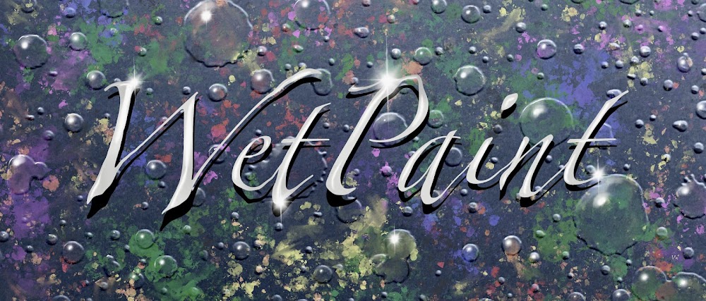
A couple of weeks ago I was playing around with layout options, and I ended up losing my original! I wasn't actually prepared for that, and was in a mad scramble to get it back. I couldn't find my original Wet Paint artwork anywhere! I put up a couple of place holders for all of 15 minutes each, then in desperation pulled up Procreate and created this one below as a substitute until I had more time. 


I don't know if I've shared any process steps for my digital Procreate pieces yet, but here is how I built up my newest title page/ banner/ header.

I began with this piece of embossed paper (using an embossing folder from Spellbinders). I photographed it and cropped it to the size I wanted.


I then create new layers, playing around with different ideas. Below is one I almost went with.


Here I experimented with the splatter brush in the spray paints. I just threw different colors down and then went in with the smudge tool, and smudged it up a bit here and there. So, below, you're just seeing two layers - the original photo of the embossed paper, and the splatter layer. 


Next came the words (layer 3). I chose my typestyle and size in white. Then, copied and pasted the same text, but positioned it slightly below and to the right of the original. This created layer 4. Using the adjustments, I took the brightness of this second text layer down to black, and positioned it behind the first text layer.


When I had that the way I liked it, I merged layers 3 and 4 into one text layer so that I could do the next step - LIQUIFY. I love liquify! It is also under adjustments. I just "pushed" the text around to distort it a bit. I also dimmed down the brightness again because I wanted highlights to show up.


In the final, top layer, shown at the top of the page, I've added bright white highlights to the letters and to the water droplets.

These are highlights using the flare brush under Luminance. I created them on two different layers so that the second one could be turned vertically. I then moved the vertical flare over the top of the horizontal flare, and then merge them onto the same layer. After that I copied and pasted as many as I wanted. They all ended up on different layers, but that makes them easy to move around, and size-adjust as needed, and they can always be merged into one layer if I like.


Thanks for stopping by!